
用 Plotly 绘制了几张精湛的图表,美翻了!!

说到Python当中的可视化模块,相信大家用的比较多的还是matplotlib、seaborn等模块,今天小编来尝试用Plotly模块为大家绘制可视化图表,和前两者相比,用Plotly模块会指出来的可视化图表有着很强的交互性。

import?numpy?as?np
import?plotly.graph_objects?as?go

#?create?dummy?data
vals?=?np.ceil(100?*?np.random.rand(5)).astype(int)
keys?=?["A",?"B",?"C",?"D",?"E"]
我们基于所生成的假数据来绘制柱状图,代码如下:
fig?=?go.Figure()
fig.add_trace(
?go.Bar(x=keys,?y=vals)
)
fig.update_layout(height=600,?width=600)
fig.show()
output
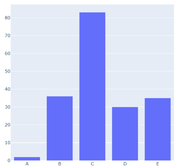
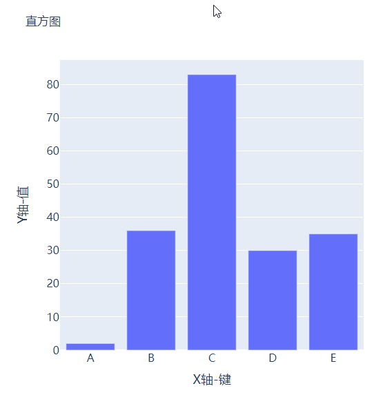
可能读者会感觉到绘制出来的图表略显简单,我们再来完善一下,添加上标题和注解,代码如下:
#?create?figure
fig?=?go.Figure()
#?绘制图表
fig.add_trace(
????go.Bar(x=keys,?y=vals,?hovertemplate="<b>Key:</b>?%{x}<br><b>Value:</b>?%{y}<extra></extra>")
)
#?更新完善图表
fig.update_layout(
????font_family="Averta",
????hoverlabel_font_family="Averta",
????title_text="直方图",
????xaxis_title_text="X轴-键",
????xaxis_title_font_size=18,
????xaxis_tickfont_size=16,
????yaxis_title_text="Y轴-值",
????yaxis_title_font_size=18,
????yaxis_tickfont_size=16,
????hoverlabel_font_size=16,
????height=600,?
????width=600
)
fig.show()

分组条形图和堆积条形图
vals_2?=?np.ceil(100?*?np.random.rand(5)).astype(int)
vals_3?=?np.ceil(100?*?np.random.rand(5)).astype(int)

vals_array?=?[vals,?vals_2,?vals_3]
然后我们遍历获取列表中的数值并且绘制成条形图,代码如下:
#?生成画布
fig?=?go.Figure()
#?绘制图表
for?i,?vals?in?enumerate(vals_array):
????fig.add_trace(
????????go.Bar(x=keys,?y=vals,?name=f"Group?{i+1}",?hovertemplate=f"<b>Group?{i+1}</b><br><b>Key:</b>?%{{x}}<br><b>Value:</b>?%{{y}}<extra></extra>")
????)
#?完善图表
fig.update_layout(
????barmode="group",
????......
)
fig.show()
output

而我们想要变成堆积状的条形图,只需要修改代码中的一处即可,将fig.update_layout(barmode="group")修改成fig.update_layout(barmode="group")即可,我们来看一下出来的样子。

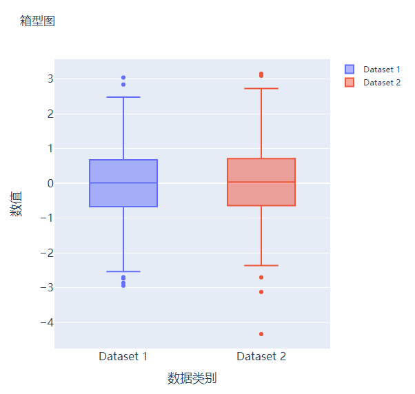
箱型图
#?create?dummy?data?for?boxplots
y1?=?np.random.normal(size=1000)
y2?=?np.random.normal(size=1000)
我们将上面生成的数据绘制成箱型图,代码如下:
#?生成画布
fig?=?go.Figure()
#?绘制图表
fig.add_trace(
????go.Box(y=y1,?name="Dataset?1"),
)
fig.add_trace(
????go.Box(y=y2,?name="Dataset?2"),
)
fig.update_layout(
????......
)
fig.show()

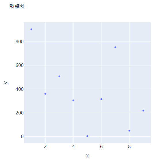
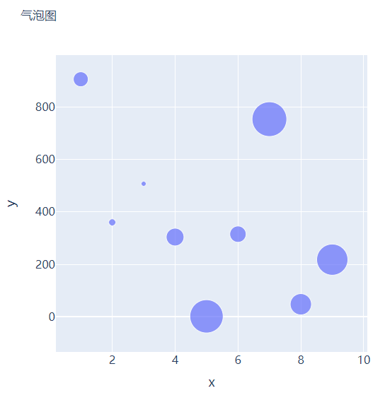
散点图和气泡图
x?=?[i?for?i?in?range(1,?10)]
y?=?np.ceil(1000?*?np.random.rand(10)).astype(int)
然后我们来绘制散点图,调用的是Scatter()方法,代码如下:
#?create?figure
fig?=?go.Figure()

fig.add_trace(
????go.Scatter(x=x,?y=y,?mode="markers",?hovertemplate="<b>x:</b>?%{x}<br><b>y:</b>?%{y}<extra></extra>")
)

fig.update_layout(
????.......
)
fig.show()
s?=?np.ceil(30?*?np.random.rand(5)).astype(int)
我们将上面用作绘制散点图的代码稍作修改,通过marker_size参数来设定散点的大小,如下所示:
fig?=?go.Figure()

fig.add_trace(
????go.Scatter(x=x,?y=y,?mode="markers",?marker_size=s,?text=s,?hovertemplate="<b>x:</b>?%{x}<br><b>y:</b>?%{y}<br><b>Size:</b>?%{text}<extra></extra>")
)
fig.update_layout(
????......
)
fig.show()

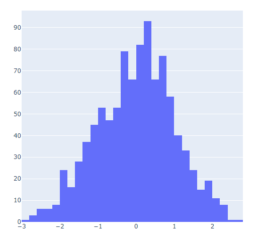
直方图
##?创建假数据
data?=?np.random.normal(size=1000)
然后我们来绘制直方图,调用的是Histogram()方法,代码如下:
#?创建画布
fig?=?go.Figure()
#?绘制图表
fig.add_trace(
????go.Histogram(x=data,?hovertemplate="<b>Bin?Edges:</b>?%{x}<br><b>Count:</b>?%{y}<extra></extra>")
)
fig.update_layout(
????height=600,
????width=600
)
fig.show()
output
我们再在上述图表的基础之上再进行进一步的格式优化,代码如下:
#?生成画布
fig?=?go.Figure()
#?绘制图表
fig.add_trace(
????go.Histogram(x=data,?histnorm="probability",?hovertemplate="<b>Bin?Edges:</b>?%{x}<br><b>Count:</b>?%{y}<extra></extra>")
)
fig.update_layout(
????......
)
fig.show()


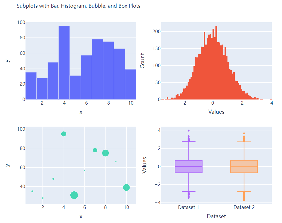
多个子图拼凑到一块儿
matplotlib模块当中的subplots()方法可以将多个子图拼凑到一块儿,那么同样地在plotly当中也可以同样地将多个子图拼凑到一块儿,调用的是plotly模块当中make_subplots函数from?plotly.subplots?import?make_subplots
##?2行2列的图表
fig?=?make_subplots(rows=2,?cols=2)
##?生成一批假数据用于图表的绘制
x?=?[i?for?i?in?range(1,?11)]
y?=?np.ceil(100?*?np.random.rand(10)).astype(int)
s?=?np.ceil(30?*?np.random.rand(10)).astype(int)
y1?=?np.random.normal(size=5000)
y2?=?np.random.normal(size=5000)
接下来我们将所要绘制的图表添加到add_trace()方法当中,代码如下:
#?绘制图表
fig.add_trace(
????go.Bar(x=x,?y=y,?hovertemplate="<b>x:</b>?%{x}<br><b>y:</b>?%{y}<extra></extra>"),
????row=1,?col=1
)
fig.add_trace(
????go.Histogram(x=y1,?hovertemplate="<b>Bin?Edges:</b>?%{x}<br><b>Count:</b>?%{y}<extra></extra>"),
????row=1,?col=2
)
fig.add_trace(
????go.Scatter(x=x,?y=y,?mode="markers",?marker_size=s,?text=s,?hovertemplate="<b>x:</b>?%{x}<br><b>y:</b>?%{y}<br><b>Size:</b>?%{text}<extra></extra>"),
????row=2,?col=1
)
fig.add_trace(
????go.Box(y=y1,?name="Dataset?1"),
????row=2,?col=2
)
fig.add_trace(
????go.Box(y=y2,?name="Dataset?2"),
????row=2,?col=2
)
fig.update_xaxes(title_font_size=18,?tickfont_size=16)
fig.update_yaxes(title_font_size=18,?tickfont_size=16)
fig.update_layout(
????......
)
fig.show()
output

CSDN音视频技术开发者在线调研正式上线!
现邀开发者们扫码在线调研


分享
点收藏
点点赞
点在看


关注公众号:拾黑(shiheibook)了解更多
[广告]赞助链接:
四季很好,只要有你,文娱排行榜:https://www.yaopaiming.com/
让资讯触达的更精准有趣:https://www.0xu.cn/


 AI100
AI100
 关注网络尖刀微信公众号
随时掌握互联网精彩


- 1 习近平将发表二〇二六年新年贺词 7904141
- 2 2026年国补政策来了 7808738
- 3 东部战区:开火!开火!全部命中! 7712893
- 4 2026年这些民生政策将惠及百姓 7616985
- 5 小学食堂米线过期2.5小时被罚5万 7519709
- 6 解放军喊话驱离台军 原声曝光 7428214
- 7 为博流量直播踩烈士陵墓?绝不姑息 7327605
- 8 每月最高800元!多地发放养老消费券 7238391
- 9 数字人民币升级 1月1日起将计付利息 7141831
- 10 2026年1月1日起 一批新规将施行 7040675