
超简单的统计结果可视化工具,推荐~~
小编在查阅资料时发现一个宝藏可视化包-R-see,该包可以将数据的统计计算结果、模型参数、预测结果以及性能估算等使用合理的可视化方式展现,帮助使用者利用可视化来获得更多信息、可交流和全面的科学报告。话不多说,接下来就让小编带大家感受下这个包的魅力(其中可能涉及统计分析知识,后期和Python一起讲解,本期只关注其可视化部分)
R-see包工作原理
得益于easystats项目下的多个优秀统计分析包(以后会出专题详细介绍)的强大功能,R-see包可使用plot()?方法将这些包所构建的对象(如参数表、基于模型的预测、性能诊断测试、相关矩阵等)可视化出来。简单来讲,就是easystats项目中的其他包负责各种统计模型的数据结果计算,see包作为对整个easystats 生态系统的可视化支持。当然,可视化结果还是可以和ggplot2其他图层结合使用的。更多详细介绍可参考:R-see包介绍[1]。接下里简单介绍下R-see包基于各种easystats项目中其他包的可视化效果。
R-see包可视化展示
基于bayestestR包
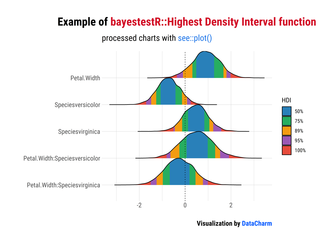
「样例一」:Highest Density Interval (HDI)
library(bayestestR)
library(insight)
library(see)
library(rstanarm)
library(ggplot2)
library(ggtext)
library(hrbrthemes)

#可视化绘制
set.seed(123)
#?model?with?fixed?effects?only
model?<-?rstanarm::stan_glm(Sepal.Length?~?Petal.Width?*?Species,?data?=?iris,?refresh?=?0)

#?model?with?fixed?and?random?effects?as?well?as?zero-inflation?component
model2?<-?insight::download_model("brms_zi_3")


#样例一:Highest Density Interval (HDI)
result?<-?hdi(model,?ci?=?c(0.5,?0.75,?0.89,?0.95))
plot(result)?+?
??scale_fill_flat()?+
??labs(x="",y="",
????title?=?"Example?of?<span style='color:#D20F26'>bayestestR::Highest?Density?Interval?function</span>",
????subtitle?=?"processed?charts?with?<span style='color:#1A73E8'>see::plot()</span>",
????caption?=?"Visualization?by?<span style='color:#0057FF'>DataCharm</span>")?+
??hrbrthemes::theme_ipsum(base_family?=?"Roboto?Condensed")?+
??theme(
????plot.title?=?element_markdown(hjust?=?0.5,vjust?=?.5,color?=?"black",
??????????????????????????????????size?=?20,?margin?=?margin(t?=?1,?b?=?12)),
????plot.subtitle?=?element_markdown(hjust?=?0,vjust?=?.5,size=15),
????plot.caption?=?element_markdown(face?=?'bold',size?=?12))
「样例二」:Support Interval
result?<-?si(model)
plot(result,?support_only?=?TRUE)?+
??scale_color_metro(palette?=?"ice")?+
??scale_fill_metro(palette?=?"ice")?+
??labs(x="",y="",
???????title?=?"Example?of?<span style='color:#D20F26'>bayestestR::Support?Interval?function</span>",
???????subtitle?=?"processed?charts?with?<span style='color:#1A73E8'>see::plot()</span>",
???????caption?=?"Visualization?by?<span style='color:#0057FF'>DataCharm</span>")?+
??hrbrthemes::theme_ipsum(base_family?=?"Roboto?Condensed")?+
??theme(
????plot.title?=?element_markdown(hjust?=?0.5,vjust?=?.5,color?=?"black",
??????????????????????????????????size?=?20,?margin?=?margin(t?=?1,?b?=?12)),
????plot.subtitle?=?element_markdown(hjust?=?0,vjust?=?.5,size=15),
????plot.caption?=?element_markdown(face?=?'bold',size?=?12))

更多其他基于bayestestR绘制统计结果可视化结果可参考:bayestestR see::plot()[2]
基于effectsize包
「样例」:
library(effectsize)
data(mtcars)
data(iris)
t_to_d(t?=?c(1,?-1.3,?-3,?2.3),?df_error?=?c(40,?35,?40,?85))?%>%
??equivalence_test(range?=?1)?%>%
??plot()?+
??labs(x="",y="",
???????title?=?"Example?of?<span style='color:#D20F26'>effectsize::equivalence_test?function</span>",
???????subtitle?=?"processed?charts?with?<span style='color:#1A73E8'>see::plot()</span>",
???????caption?=?"Visualization?by?<span style='color:#0057FF'>DataCharm</span>")?+
??hrbrthemes::theme_ipsum(base_family?=?"Roboto?Condensed")?+
??theme(
????plot.title?=?element_markdown(hjust?=?0.5,vjust?=?.5,color?=?"black",
??????????????????????????????????size?=?20,?margin?=?margin(t?=?1,?b?=?12)),
????plot.subtitle?=?element_markdown(hjust?=?0,vjust?=?.5,size=15),
????plot.caption?=?element_markdown(face?=?'bold',size?=?12))??

更多其他基于effectsize绘制统计结果可视化结果可参考:effectsize see::plot()[3]
基于modelbased包
「样例」:
library(modelbased)
model?<-?stan_glm(Sepal.Width?~?Species,?data?=?iris,?refresh?=?0)

contrasts?<-?estimate_contrasts(model)
means?<-?estimate_means(model)

plot(contrasts,?means)?+
??labs(x="",y="",
???????title?=?"Example?of?<span style='color:#D20F26'>modelbased::estimate_means?function</span>",
???????subtitle?=?"processed?charts?with?<span style='color:#1A73E8'>see::plot()</span>",
???????caption?=?"Visualization?by?<span style='color:#0057FF'>DataCharm</span>")?+
??hrbrthemes::theme_ipsum(base_family?=?"Roboto?Condensed")?+
??theme(
????plot.title?=?element_markdown(hjust?=?0.5,vjust?=?.5,color?=?"black",
??????????????????????????????????size?=?20,?margin?=?margin(t?=?1,?b?=?12)),
????plot.subtitle?=?element_markdown(hjust?=?0,vjust?=?.5,size=15),
????plot.caption?=?element_markdown(face?=?'bold',size?=?12))??

更多其他基于modelbased绘制统计结果可视化结果可参考:modelbased see::plot()[4]
基于parameters包
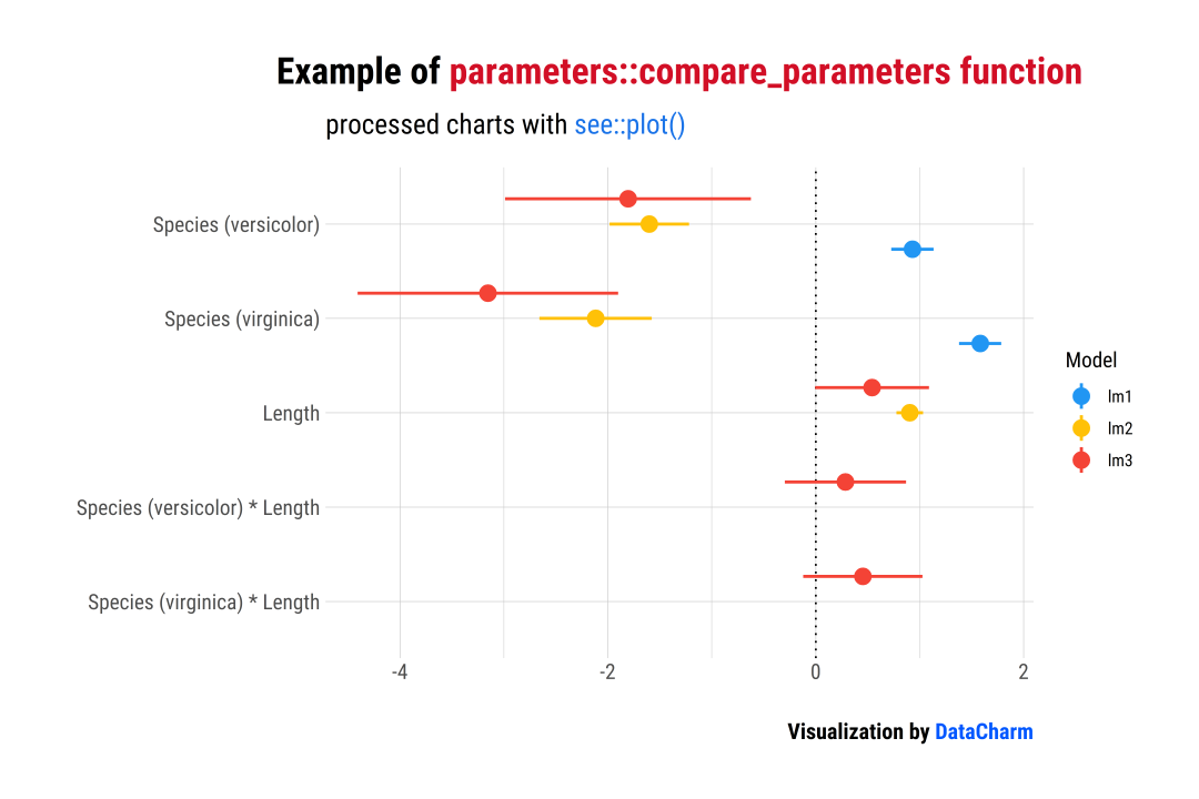
「样例一」:Comparison of Models
library(parameters)
data(iris)
#?shorter?variable?name
iris$Length?<-?iris$Petal.Length
lm1?<-?lm(Sepal.Length?~?Species,?data?=?iris)
lm2?<-?lm(Sepal.Length?~?Species?+?Length,?data?=?iris)
lm3?<-?lm(Sepal.Length?~?Species?*?Length,?data?=?iris)

result?<-?compare_parameters(lm1,?lm2,?lm3)
plot(result)?+?
??labs(x="",y="",
???????title?=?"Example?of?<span style='color:#D20F26'>parameters::compare_parameters?function</span>",
???????subtitle?=?"processed?charts?with?<span style='color:#1A73E8'>see::plot()</span>",
???????caption?=?"Visualization?by?<span style='color:#0057FF'>DataCharm</span>")?+
??hrbrthemes::theme_ipsum(base_family?=?"Roboto?Condensed")?+
??theme(
????plot.title?=?element_markdown(hjust?=?0.5,vjust?=?.5,color?=?"black",
??????????????????????????????????size?=?20,?margin?=?margin(t?=?1,?b?=?12)),
????plot.subtitle?=?element_markdown(hjust?=?0,vjust?=?.5,size=15),
????plot.caption?=?element_markdown(face?=?'bold',size?=?12))??
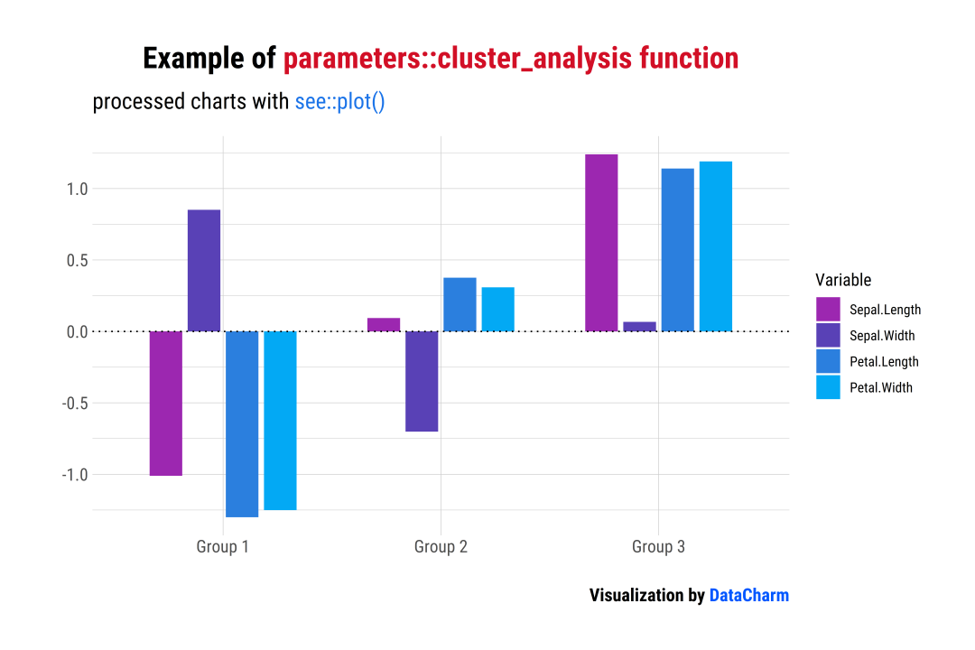
「样例二」:Cluster Analysis
data(iris)
result?<-?cluster_analysis(iris[,?1:4],?n_clusters?=?3)
plot(result)?+
??scale_fill_material_d(palette?=?"ice")?+
??labs(x="",y="",
???????title?=?"Example?of?<span style='color:#D20F26'>parameters::cluster_analysis?function</span>",
???????subtitle?=?"processed?charts?with?<span style='color:#1A73E8'>see::plot()</span>",
???????caption?=?"Visualization?by?<span style='color:#0057FF'>DataCharm</span>")?+
??hrbrthemes::theme_ipsum(base_family?=?"Roboto?Condensed")?+
??theme(
????plot.title?=?element_markdown(hjust?=?0.5,vjust?=?.5,color?=?"black",
??????????????????????????????????size?=?20,?margin?=?margin(t?=?1,?b?=?12)),
????plot.subtitle?=?element_markdown(hjust?=?0,vjust?=?.5,size=15),
????plot.caption?=?element_markdown(face?=?'bold',size?=?12))?
更多其他基于parameters绘制统计结果可视化结果可参考:parameters see::plot()[5]
基于performance包
「样例」:Check for Normal Distributed Random Effects
library(performance)
library(lme4)

model?<-?lmer(Reaction?~?Days?+?(Days?|?Subject),?sleepstudy)
result?<-?check_normality(model,?effects?=?"random")

plot(result)

「样例二」:Check for Homogeneity
model?<-?lm(len?~?supp?+?dose,?data?=?ToothGrowth)
result?<-?check_homogeneity(model)

plot(result)?+
??labs(x="",y="",
???????title?=?"Example?of?<span style='color:#D20F26'>performance::check_homogeneity?function</span>",
???????subtitle?=?"processed?charts?with?<span style='color:#1A73E8'>see::plot()</span>",
???????caption?=?"Visualization?by?<span style='color:#0057FF'>DataCharm</span>")?+
??hrbrthemes::theme_ipsum(base_family?=?"Roboto?Condensed")?+
??theme(
????plot.title?=?element_markdown(hjust?=?0.5,vjust?=?.5,color?=?"black",
??????????????????????????????????size?=?20,?margin?=?margin(t?=?1,?b?=?12)),
????plot.subtitle?=?element_markdown(hjust?=?0,vjust?=?.5,size=15),
????plot.caption?=?element_markdown(face?=?'bold',size?=?12))??

更多其他基于performance绘制统计结果可视化结果可参考:performance see::plot()[6]
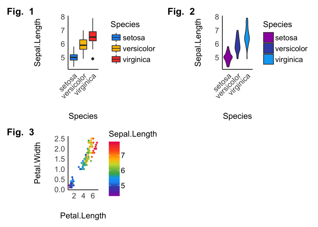
多图绘制(Multiple plots)
R-see包还提供plots()?函数用于绘制多个可视化图,如下:
p1?<-?ggplot(iris,?aes(x?=?Species,?y?=?Sepal.Length,?fill?=?Species))?+
??geom_boxplot()?+
??theme_modern(axis.text.angle?=?45)?+
??scale_fill_material_d()

p2?<-?ggplot(iris,?aes(x?=?Species,?y?=?Sepal.Length,?fill?=?Species))?+
??geom_violin()?+
??theme_modern(axis.text.angle?=?45)?+
??scale_fill_material_d(palette?=?"ice")

p3?<-?ggplot(iris,?aes(x?=?Petal.Length,?y?=?Petal.Width,?color?=?Sepal.Length))?+
??geom_point2()?+
??theme_modern()?+
??scale_color_material_c(palette?=?"rainbow")

plots(p1,?p2,?p3,
??????n_columns?=?2,
??????tags?=?paste("Fig.?",?1:3))
总结
以上就是小编关于R-see包的简单介绍,其中涉及到其他优秀包(如modelbased、performance等)会在后期开设专题和Python进行对比介绍。本期推文还是希望小伙伴们可以感受下R-see包的强大绘图能力,希望对大家有所帮助。
「完」
关注公众号:拾黑(shiheibook)了解更多
[广告]赞助链接:
四季很好,只要有你,文娱排行榜:https://www.yaopaiming.com/
让资讯触达的更精准有趣:https://www.0xu.cn/
 数据分析
数据分析
 关注网络尖刀微信公众号
随时掌握互联网精彩


- 1 习近平将发表二〇二六年新年贺词 7904141
- 2 2026年国补政策来了 7808738
- 3 东部战区:开火!开火!全部命中! 7712893
- 4 2026年这些民生政策将惠及百姓 7616985
- 5 小学食堂米线过期2.5小时被罚5万 7519709
- 6 解放军喊话驱离台军 原声曝光 7428214
- 7 为博流量直播踩烈士陵墓?绝不姑息 7327605
- 8 每月最高800元!多地发放养老消费券 7238391
- 9 数字人民币升级 1月1日起将计付利息 7141831
- 10 2026年1月1日起 一批新规将施行 7040675