
用 Python 制作数据大屏,超简单

Streamlit模块来制作一个数据面板,将数据更加直观地呈现给别人观看,整个页面大致如下图所示: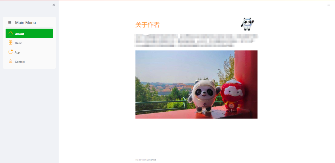
制作工具栏

streamlit_option_menu模块来实现的,我们来调用其中的option_menu函数,我们需要明确里面的几个参数:menu_title:工具栏的标题,必填options: 规定要有哪几个选项栏,必填menu_icon: 每一个选项卡的图标,非必填default_index: 默认勾选的选项按钮,一般默认勾选的都是第一个选项按钮styles: 每个选项按钮的样式
with?st.sidebar:
????choose?=?option_menu("Main?Menu",?["About",?"Demo","App",?"Contact"],
?????????????????????????icons=['house',?'file-slides','app-indicator','person?lines?fill'],
?????????????????????????menu_icon="list",?default_index=0,
?????????????????????????styles={
????????"container":?{"padding":?"5!important",?"background-color":?"#fafafa"},
????????"icon":?{"color":?"orange",?"font-size":?"25px"},
????????"nav-link":?{"font-size":?"16px",?"text-align":?"left",?"margin":"0px",?"--hover-color":?"#eee"},
????????"nav-link-selected":?{"background-color":?"#02ab21"},
????})
主页面的设计
About页面的功能主要是对整个网页的内容、用途做一个简单的介绍,代码逻辑主要是通过if else来判断,例如当我们点击About这个选项的时候。logo?=?Image.open(r'952.png')
profile?=?Image.open(r'5052.png')
if?choose?==?"About":
????col1,?col2?=?st.columns([0.8,?0.2])
????with?col1:??#?To?display?the?header?text?using?css?style
????????st.markdown("""?<style>?.font?{
????????font-size:35px?;?font-family:?'Cooper?Black';?color:?#FF9633;}?
????????</style>?""",?unsafe_allow_html=True)
????????st.markdown('<p?class="font">简介</p>',?unsafe_allow_html=True)
????with?col2:??#?To?display?brand?log
????????st.image(logo,?width=130)
????st.write(
????????"介绍......")
????st.image(profile,?width=700)
Demo视频,代码如下:elif?choose=='Demo':
????st.markdown("""?<style>?.font?{
????font-size:25px?;?font-family:?'Cooper?Black';?color:?#FF9633;}?
????</style>?""",?unsafe_allow_html=True)
????st.markdown('<p?class="font">Watch?a?short?demo?of?the?app...</p>',?unsafe_allow_html=True)
????video_file?=?open('Demo.mp4',?'rb')
????video_bytes?=?video_file.read()
????st.video(video_bytes)
raceplotly模块来绘制动态可交互的柱状图,如下图所示

elif?choose=='App':
????#Add?a?file?uploader?to?allow?users?to?upload?their?csv?file
????st.markdown("""?<style>?.font?{
????font-size:25px?;?font-family:?'Cooper?Black';?color:?#FF9633;}?
????</style>?""",?unsafe_allow_html=True)
????st.markdown('<p?class="font">Upload?your?data...</p>',?unsafe_allow_html=True)?#use?st.markdown()?with?CSS?style?to?create?a?nice-formatted?header/text
????uploaded_file?=?st.file_uploader('',type=['csv'])?#Only?accepts?csv?file?format
????if?uploaded_file?is?not?None:
????????df=pd.read_csv(uploaded_file)??#use?AgGrid?to?create?a?aggrid?table?that's?more?visually?appealing?than?plain?pandas?datafame
????????grid_response?=?AgGrid(
????????????df,editable=False,
????????????height=300,fit_columns_on_grid_load=True,
????????????theme='blue',width=100,
????????????allow_unsafe_jscode=True,
????????????)
????????updated?=?grid_response['data']
????????df?=?pd.DataFrame(updated)
????????st.write('---')
????????st.markdown('<p?class="font">Set?Parameters...</p>',?unsafe_allow_html=True)
????????column_list?=?list(df)
????????column_list?=?deque(column_list)
????????column_list.appendleft('-')
????????with?st.form(key='columns_in_form'):
????????????text_style?=?'<p?style="font-family:sans-serif;?color:red;?font-size:?15px;">***These?input?fields?are?required***</p>'
????????????st.markdown(text_style,?unsafe_allow_html=True)
????????????col1,?col2,?col3?=?st.columns([1,?1,?1])
????????????......
????????????col4,?col5,?col6?=?st.columns([1,?1,?1])
????????????......
????????????col7,?col8,?col9?=?st.columns([1,?1,?1])
????????????......
????????????col10,?col11,?col12?=?st.columns([1,?1,?1])
????????????......
????????????submitted?=?st.form_submit_button('Submit')
????????????st.write('---')
????????????if?submitted:
????????????????raceplot?=?barplot(df,?item_column=item_column,?value_column=value_column,?time_column=time_column,
???????????????????????????????????top_entries=num_items)
????????????????fig?=?raceplot.plot(item_label=item_label,?value_label=value_label,?frame_duration=frame_duration,
????????????????????????????????????date_format=date_format,?orientation=orientation)
????????????????fig.update_layout(......)
????????????????st.plotly_chart(fig,?use_container_width=True)
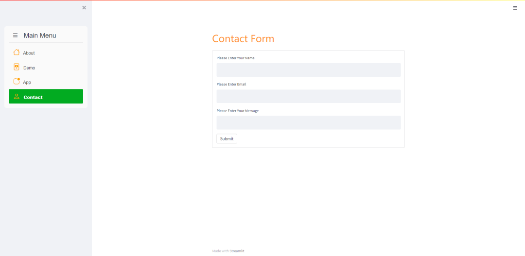
elif?choose?==?"Contact":
????st.markdown("""?<style>?.font?{
????font-size:35px?;?font-family:?'Cooper?Black';?color:?#FF9633;}?
????</style>?""",?unsafe_allow_html=True)
????st.markdown('<p?class="font">Contact?Form</p>',?unsafe_allow_html=True)
????with?st.form(key='columns_in_form2',clear_on_submit=True):?
????????Name=st.text_input(label='姓名')?
????????Email=st.text_input(label='联系方式')?
????????Message=st.text_input(label='您想要说的是')?
????????submitted?=?st.form_submit_button('提交')
????????if?submitted:
????????????st.write('感谢!')


分享

点收藏

点点赞

点在看
关注公众号:拾黑(shiheibook)了解更多
[广告]赞助链接:
四季很好,只要有你,文娱排行榜:https://www.yaopaiming.com/
让资讯触达的更精准有趣:https://www.0xu.cn/


 AI100
AI100
 关注网络尖刀微信公众号
随时掌握互联网精彩
赞助链接


排名
热点
搜索指数
- 1 习近平将发表二〇二六年新年贺词 7904141
- 2 2026年国补政策来了 7808738
- 3 东部战区:开火!开火!全部命中! 7712893
- 4 2026年这些民生政策将惠及百姓 7616985
- 5 小学食堂米线过期2.5小时被罚5万 7519709
- 6 解放军喊话驱离台军 原声曝光 7428214
- 7 为博流量直播踩烈士陵墓?绝不姑息 7327605
- 8 每月最高800元!多地发放养老消费券 7238391
- 9 数字人民币升级 1月1日起将计付利息 7141831
- 10 2026年1月1日起 一批新规将施行 7040675