
4000字,25张精美交互图表,开启Plotly Express之旅

Plotly Express 是一个新的高级 Python 可视化库,它是 Plotly.py 的高级封装,为复杂图表提供简单的语法。最主要的是 Plotly 可以与 Pandas 数据类型 DataFrame 完美的结合,对于数据分析、可视化来说实在是太便捷了,而且是完全免费的,非常值得尝试
下面我们使用 Ployly 的几个内置数据集来进行相关图表绘制的演示

数据集
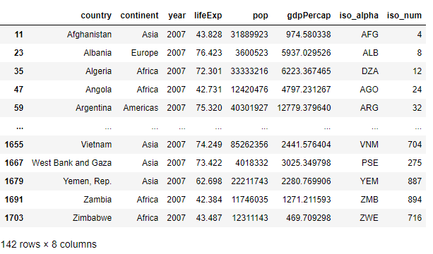
不同国家历年GDP收入与人均寿命
gap?=?px.data.gapminder()
gap2007?=?gap.query("year==2007")
gap2007
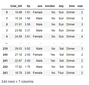
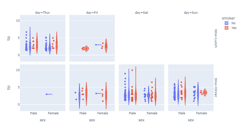
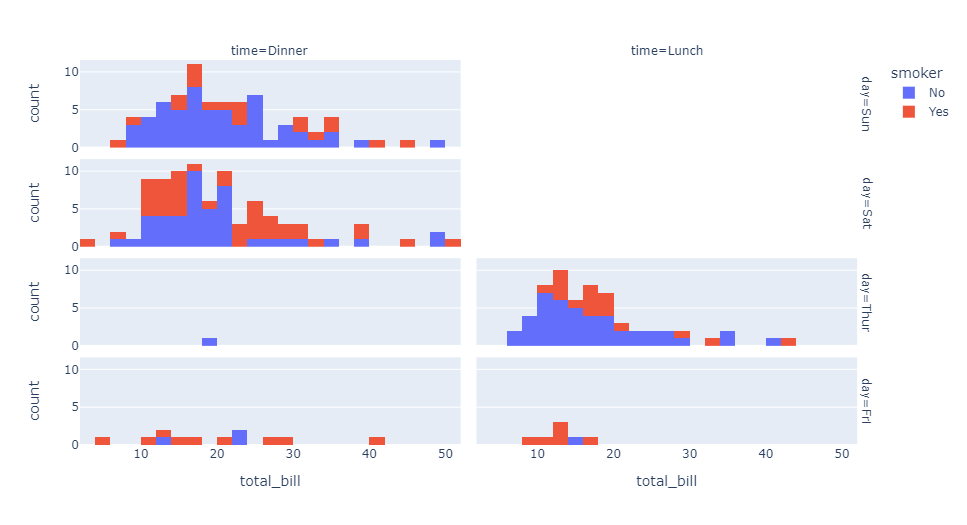
餐馆的订单流水
tips?=?px.data.tips()
tips
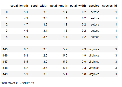
鸢尾花
iris?=?px.data.iris()??
iris
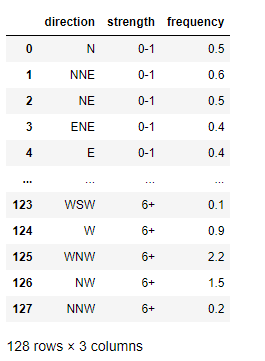
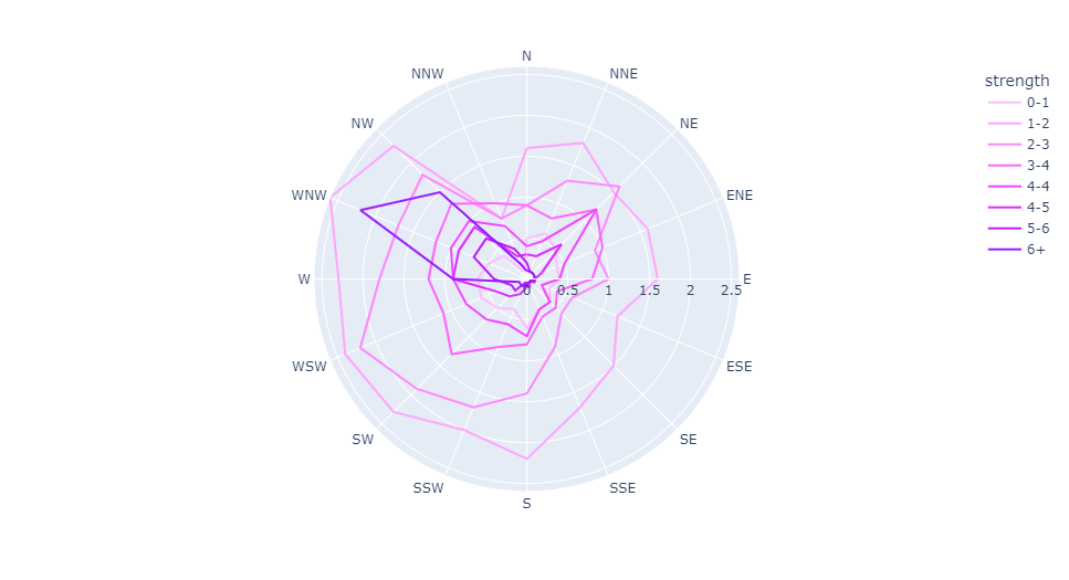
风力数据
wind?=?px.data.wind()??
wind
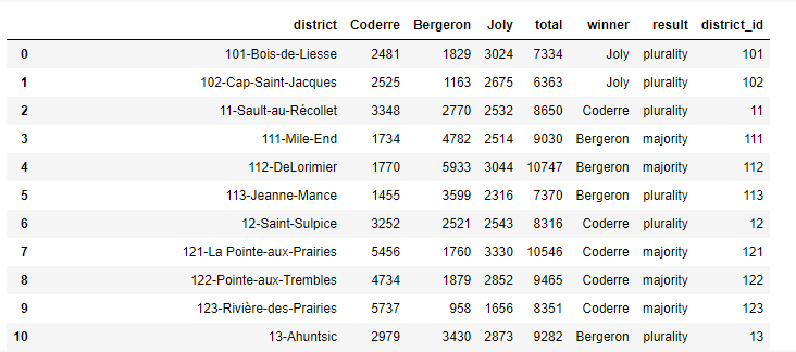
2013年蒙特利尔市长选举投票结果
election?=?px.data.election()?
election
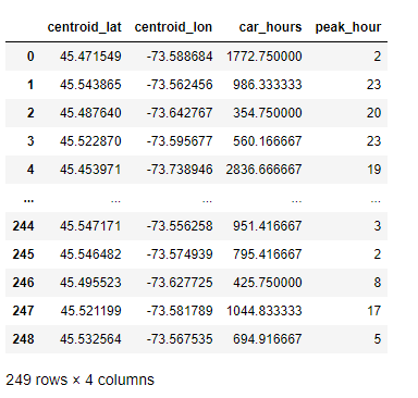
蒙特利尔一个区域中心附近的汽车共享服务的可用性
carshare?=?px.data.carshare()
carshare
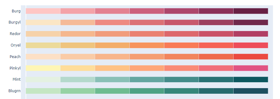
内置调色板
卡通片的色彩和序列
px.colors.carto.swatches()?
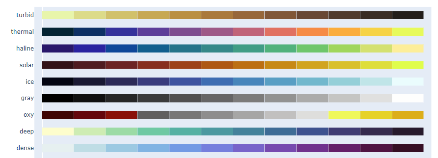
CMOcean项目的色阶
px.colors.cmocean.swatches()?
px.colors.colorbrewer
px.colors.cyclical?
px.colors.diverging?????
px.colors.qualitative
px.colors.sequential????????
Plotly Express 基本绘图
散点图
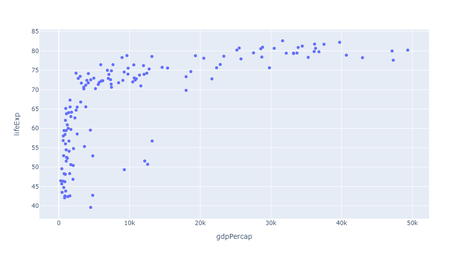
px.scatter(gap2007,?x="gdpPercap",?y="lifeExp")
px.scatter(gap2007,?x="gdpPercap",?y="lifeExp",?color="continent")

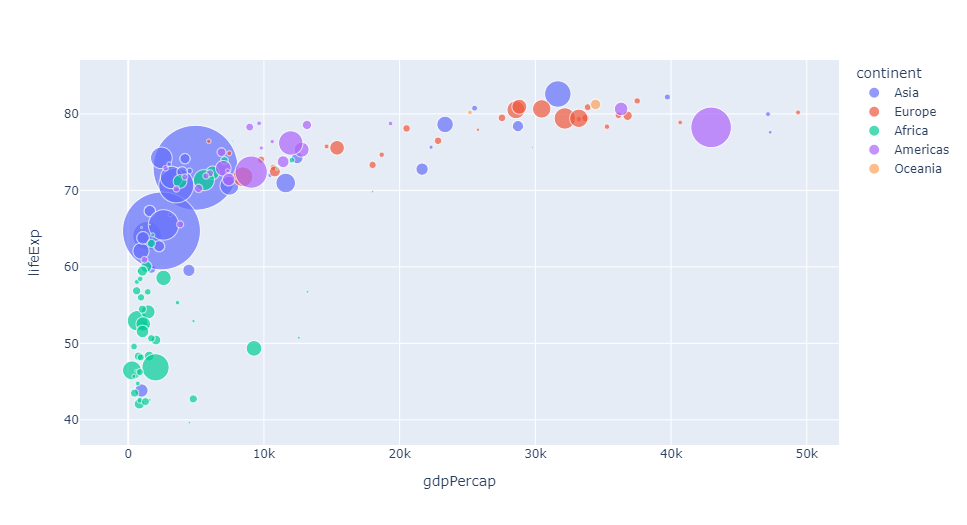
px.scatter(gap2007,?x="gdpPercap",?y="lifeExp",?color="continent",?size="pop",?size_max=60)

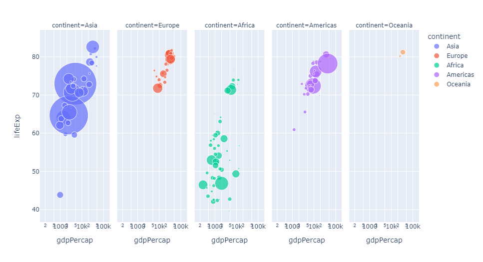
px.scatter(gap2007,?x="gdpPercap",?y="lifeExp",?color="continent",?size="pop",?
???????????size_max=60,?hover_name="country",?facet_col="continent",?log_x=True)
px.scatter(gap,?x="gdpPercap",?y="lifeExp",?color="continent",?size="pop",?
???????????size_max=60,?hover_name="country",?animation_frame="year",?animation_group="country",?log_x=True,
??????????range_x=[100,?100000],?range_y=[25,?90],?labels=dict(pop="Population",?gdpPercap="GDP?per?Capa",?lifeExp="Life?Expectancy"))

地理信息图
px.choropleth(gap,?locations="iso_alpha",?color="lifeExp",?hover_name="country",?animation_frame="year",?
??????????????color_continuous_scale=px.colors.sequential.Plasma,?projection="natural?earth")

矩阵散点图
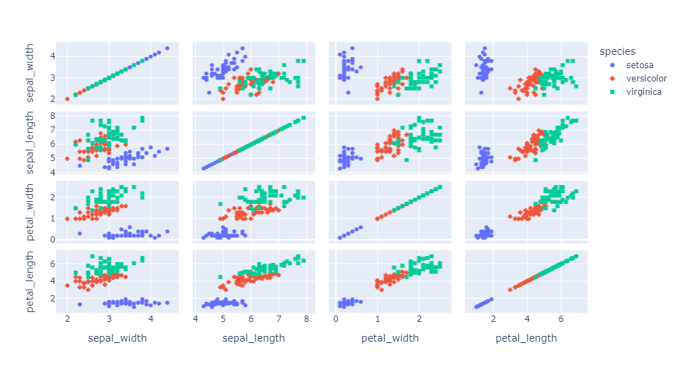
px.scatter_matrix(iris,?dimensions=['sepal_width',?'sepal_length',?'petal_width',?'petal_length'],?color='species',?symbol='species')
平行坐标图
px.parallel_coordinates(tips,?color='size',?color_continuous_scale=px.colors.sequential.Inferno)

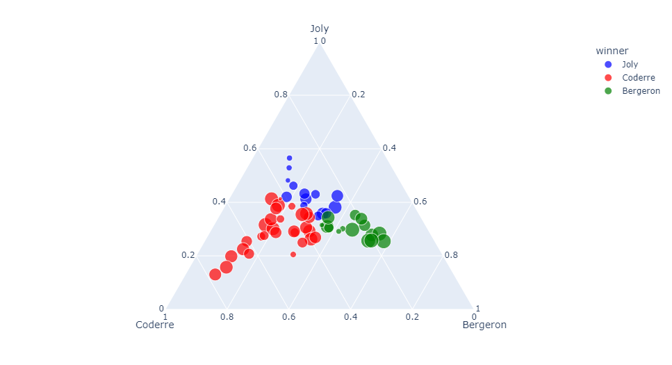
三元散点图
px.scatter_ternary(election,?a="Joly",?b="Coderre",?c="Bergeron",?color="winner",?size="total",?hover_name="district",
???????????????????size_max=15,?color_discrete_map?=?{"Joly":?"blue",?
???????????????????"Bergeron":?"green",?"Coderre":"red"}?)
极坐标线条图
px.line_polar(wind,?r="frequency",?theta="direction",?color="strength",?
????????????line_close=True,color_discrete_sequence=px.colors.sequential.Plotly3[-2::-1])
小提琴图
px.violin(tips,?y="tip",?x="sex",?color="smoker",?facet_col="day",?facet_row="time",box=True,?points="all",?
??????????category_orders={"day":?["Thur",?"Fri",?"Sat",?"Sun"],?"time":?["Lunch",?"Dinner"]},
??????????hover_data=tips.columns)
极坐标条形图
px.bar_polar(wind,?r="frequency",?theta="direction",?color="strength",
????????????color_discrete_sequence=?px.colors.sequential.Plotly3[-2::-1])

并行类别图
px.parallel_categories(tips,?color="size",?color_continuous_scale=px.
????????????colors.sequential.Inferno)

直方图
px.histogram(tips,?x="total_bill",?color="smoker",facet_row="day",?facet_col="time")
三维散点图
px.scatter_3d(election,?x="Joly",?y="Coderre",?z="Bergeron",?color="winner",?
??????????????size="total",?hover_name="district",symbol="result",?
??????????????color_discrete_map?=?{"Joly":?"blue",?"Bergeron":?"green",?
??????????????"Coderre":"red"})

密度等值线图
px.density_contour(iris,?x="sepal_width",?y="sepal_length",?color="species")

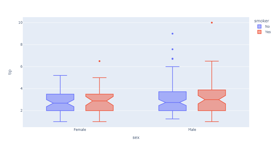
箱形图
px.box(tips,?x="sex",?y="tip",?color="smoker",?notched=True)
地理坐标线条图
px.line_geo(gap.query("year==2007"),?locations="iso_alpha",?
????????????color="continent",?projection="orthographic")

条线图
px.line(gap,?x="year",?y="lifeExp",?color="continent",?
????????line_group="country",?hover_name="country",
????????line_shape="spline",?render_mode="svg")

面积图
px.area(gap,?x="year",?y="pop",?color="continent",?
????????line_group="country")

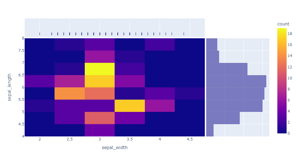
热力图
px.density_heatmap(iris,?x="sepal_width",?y="sepal_length",?
???????????????????marginal_x="rug",?marginal_y="histogram")
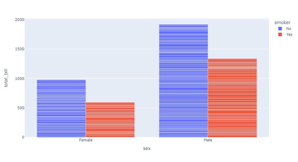
条形图
px.bar(tips,?x="sex",?y="total_bill",?color="smoker",?barmode="group")


分享

点收藏

点点赞

点在看
关注公众号:拾黑(shiheibook)了解更多
[广告]赞助链接:
四季很好,只要有你,文娱排行榜:https://www.yaopaiming.com/
让资讯触达的更精准有趣:https://www.0xu.cn/
 AI100
AI100
 关注网络尖刀微信公众号
随时掌握互联网精彩
赞助链接


排名
热点
搜索指数
- 1 习近平将发表二〇二六年新年贺词 7904141
- 2 2026年国补政策来了 7808738
- 3 东部战区:开火!开火!全部命中! 7712893
- 4 2026年这些民生政策将惠及百姓 7616985
- 5 小学食堂米线过期2.5小时被罚5万 7519709
- 6 解放军喊话驱离台军 原声曝光 7428214
- 7 为博流量直播踩烈士陵墓?绝不姑息 7327605
- 8 每月最高800元!多地发放养老消费券 7238391
- 9 数字人民币升级 1月1日起将计付利息 7141831
- 10 2026年1月1日起 一批新规将施行 7040675