
Python 实现社交网络可视化,看看你的人脉影响力如何

Python的第三方库来进行社交网络的可视化
数据来源
pandas模块读取
数据的读取和清洗
import?pandas?as?pd
import?janitor
import?datetime

from?IPython.core.display?import?display,?HTML
from?pyvis?import?network?as?net
import?networkx?as?nx
df_ori?=?pd.read_csv("Connections.csv",?skiprows=3)
df_ori.head()
df?=?(
????df_ori
????.clean_names()?#?去除掉字符串中的空格以及大写变成小写
????.drop(columns=['first_name',?'last_name',?'email_address'])?#?去除掉这三列
????.dropna(subset=['company',?'position'])?#?去除掉company和position这两列当中的空值
????.to_datetime('connected_on',?format='%d?%b?%Y')
??)
????????????????????company????????????position?connected_on
0????????????????xxxxxxxxxx??Talent?Acquisition???2021-08-15
1???????????????xxxxxxxxxxxx???Associate?Partner???2021-08-14
2??????????????????????xxxxx????????????????猎头顾问???2021-08-14
3??xxxxxxxxxxxxxxxxxxxxxxxxx??????????Consultant???2021-07-26
4????xxxxxxxxxxxxxxxxxxxxxx?????Account?Manager???2021-07-19
数据的分析与可视化
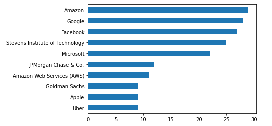
df['company'].value_counts().head(10).plot(kind="barh").invert_yaxis()
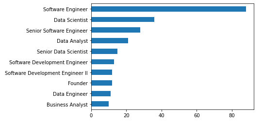
df['position'].value_counts().head(10).plot(kind="barh").invert_yaxis()
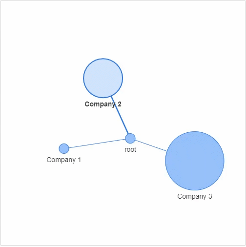
节点:社交网络当中的每个参与者 边缘:代表着每一个参与者的关系以及关系的紧密程度
networkx模块以及pyvis模块,g?=?nx.Graph()
g.add_node(0,?label?=?"root")?#?intialize?yourself?as?central?node
g.add_node(1,?label?=?"Company?1",?size=10,?title="info1")
g.add_node(2,?label?=?"Company?2",?size=40,?title="info2")
g.add_node(3,?label?=?"Company?3",?size=60,?title="info3")
size代表着节点的大小,然后我们将这些个节点相连接g.add_edge(0,?1)
g.add_edge(0,?2)
g.add_edge(0,?3)
df_company?=?df['company'].value_counts().reset_index()
df_company.columns?=?['company',?'count']
df_company?=?df_company.sort_values(by="count",?ascending=False)
df_company.head(10)
????????????????????????????company??count
0????????????????????????????Amazon?????xx
1????????????????????????????Google?????xx
2??????????????????????????Facebook?????xx
3???Stevens?Institute?of?Technology?????xx
4?????????????????????????Microsoft?????xx
5??????????????JPMorgan?Chase?&?Co.?????xx
6?????????Amazon?Web?Services?(AWS)?????xx
9?????????????????????????????Apple??????x
10????????????????????Goldman?Sachs??????x
8????????????????????????????Oracle??????x
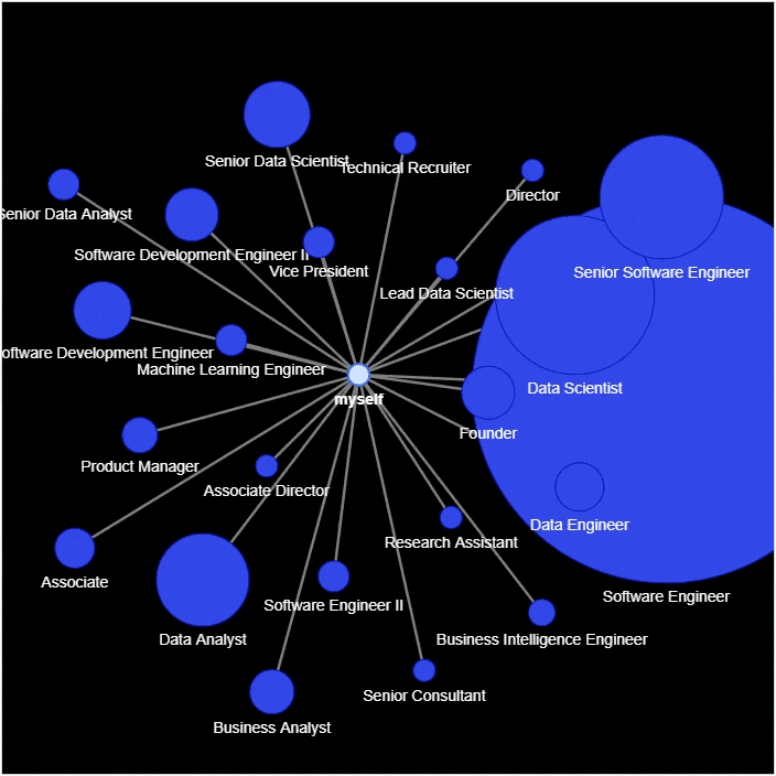
#?实例化网络
g?=?nx.Graph()
g.add_node('myself')?#?将自己放置在网络的中心

#?遍历数据集当中的每一行
for?_,?row?in?df_company_reduced.iterrows():

????#?将公司名和统计结果赋值给新的变量
????company?=?row['company']
????count?=?row['count']

????title?=?f"<b>{company}</b>?–?{count}"
????positions?=?set([x?for?x?in?df[company?==?df['company']]['position']])
????positions?=?''.join('<li>{}</li>'.format(x)?for?x?in?positions)

????position_list?=?f"<ul>{positions}</ul>"
????hover_info?=?title?+?position_list

????g.add_node(company,?size=count*2,?title=hover_info,?color='#3449eb')
????g.add_edge('root',?company,?color='grey')

#?生成网络图表
nt?=?net.Network(height='700px',?width='700px',?bgcolor="black",?font_color='white')
nt.from_nx(g)
nt.hrepulsion()

nt.show('company_graph.html')
display(HTML('company_graph.html'))

df_position?=?df['position'].value_counts().reset_index()
df_position.columns?=?['position',?'count']
df_position?=?df_position.sort_values(by="count",?ascending=False)
df_position.head(10)
???????????????????????????position??count
0?????????????????Software?Engineer?????xx
1????????????????????Data?Scientist?????xx
2??????????Senior?Software?Engineer?????xx
3??????????????????????Data?Analyst?????xx
4?????????????Senior?Data?Scientist?????xx
5?????Software?Development?Engineer?????xx
6??Software?Development?Engineer?II?????xx
7???????????????????????????Founder?????xx
8?????????????????????Data?Engineer?????xx
9??????????????????Business?Analyst?????xx
g?=?nx.Graph()
g.add_node('myself')?#?将自己放置在网络的中心

for?_,?row?in?df_position_reduced.iterrows():

????#?将岗位名和统计结果赋值给新的变量
????position?=?row['position']
????count?=?row['count']

????title?=?f"<b>{position}</b>?–?{count}"
????positions?=?set([x?for?x?in?df[position?==?df['position']]['position']])
????positions?=?''.join('<li>{}</li>'.format(x)?for?x?in?positions)

????position_list?=?f"<ul>{positions}</ul>"
????hover_info?=?title?+?position_list

????g.add_node(position,?size=count*2,?title=hover_info,?color='#3449eb')
????g.add_edge('root',?position,?color='grey')

#?生成网络图表
nt?=?net.Network(height='700px',?width='700px',?bgcolor="black",?font_color='white')
nt.from_nx(g)
nt.hrepulsion()

nt.show('position_graph.html')


分享

点收藏

点点赞

点在看
关注公众号:拾黑(shiheibook)了解更多
[广告]赞助链接:
四季很好,只要有你,文娱排行榜:https://www.yaopaiming.com/
让资讯触达的更精准有趣:https://www.0xu.cn/


 AI100
AI100
 关注网络尖刀微信公众号
随时掌握互联网精彩
赞助链接


排名
热点
搜索指数
- 1 习近平将发表二〇二六年新年贺词 7904141
- 2 2026年国补政策来了 7808738
- 3 东部战区:开火!开火!全部命中! 7712893
- 4 2026年这些民生政策将惠及百姓 7616985
- 5 小学食堂米线过期2.5小时被罚5万 7519709
- 6 解放军喊话驱离台军 原声曝光 7428214
- 7 为博流量直播踩烈士陵墓?绝不姑息 7327605
- 8 每月最高800元!多地发放养老消费券 7238391
- 9 数字人民币升级 1月1日起将计付利息 7141831
- 10 2026年1月1日起 一批新规将施行 7040675